Case Study
Assembly Design System
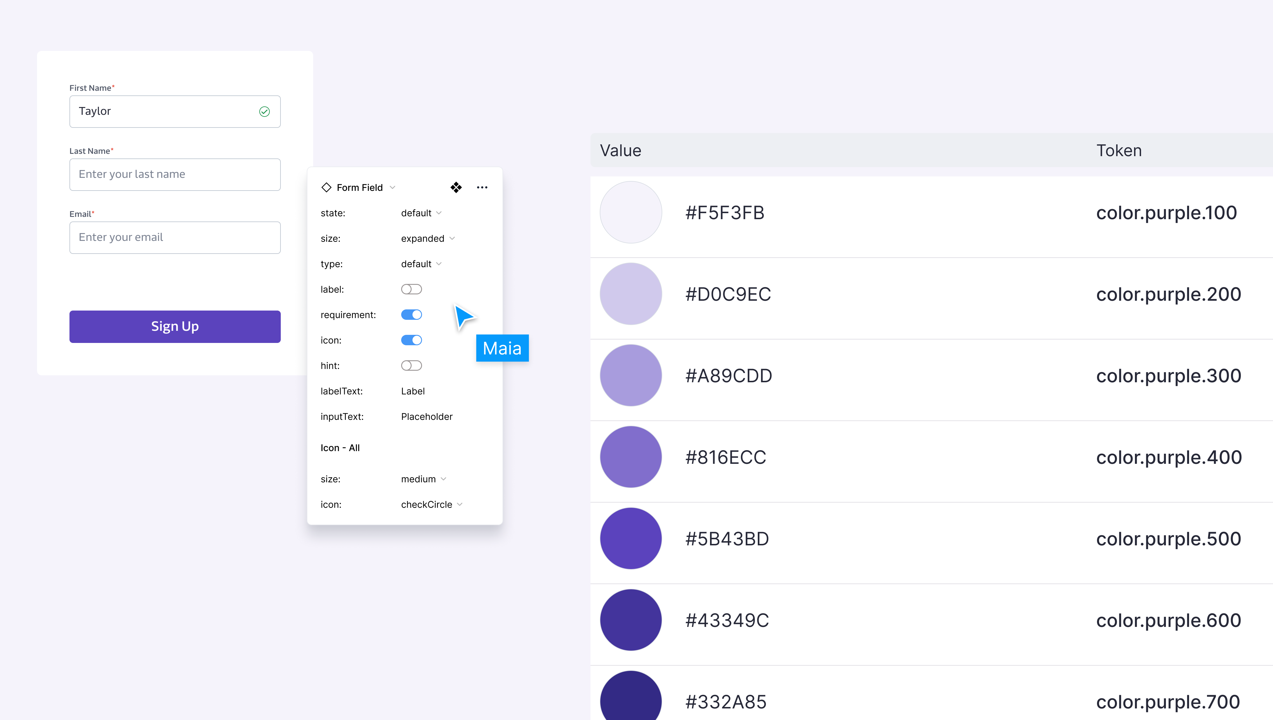
Collaborated with Genome Medical's engineering team to create Assembly — a unified, accessible system of styles and components relying on a platform-agnostic token system as a source of truth.
Problem Space
No system, only scattered parts
When I joined Genome Medical, no design system existed — only scattered components and inconsistent styling practices.
Pain Points:
- Inconsistent component usage created fragmented brand experience for end users
- Designers wasted time recreating elements due to lack of flexible, centralized components
- Knowledge gaps within design team regarding new components or page styling
- Misalignment between design and engineering lacking shared documentation
Goals
Consistency, speed, shared language
Enhanced brand consistency, reduced time for designers and engineers, bridged cross-team communication through shared language.
Deliverables:
- Figma asset library containing all components
- Figma style library
- Component and style documentation via Figma Tokens plugin
- Storybook library for all components
Created an Epic within the scrum process, dedicating front-end engineering capacity each sprint.
Outcomes
Atomic design, tokens, and incremental delivery
Applied atomic design principles. Leveraged Figma's component variants, autolayout, and nested instances. Used Tokens Studio plugin for platform-agnostic token system. Conducted audit of existing production styles, identifying substantial overlap and inconsistency. Drew from Nathan Curtis' token methodology.
Designer and engineering partner worked incrementally, meeting weekly.
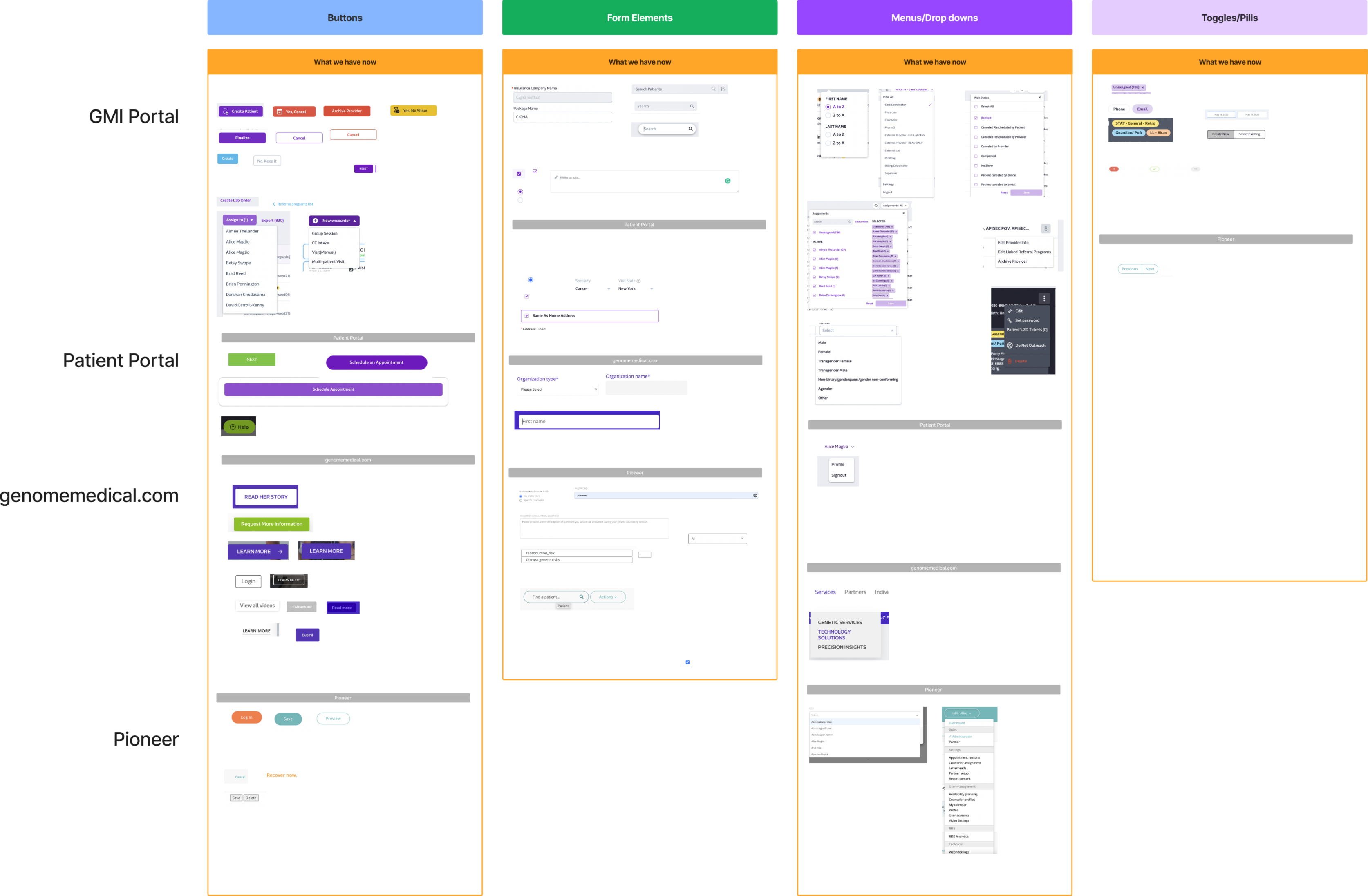
Component Audit Sample
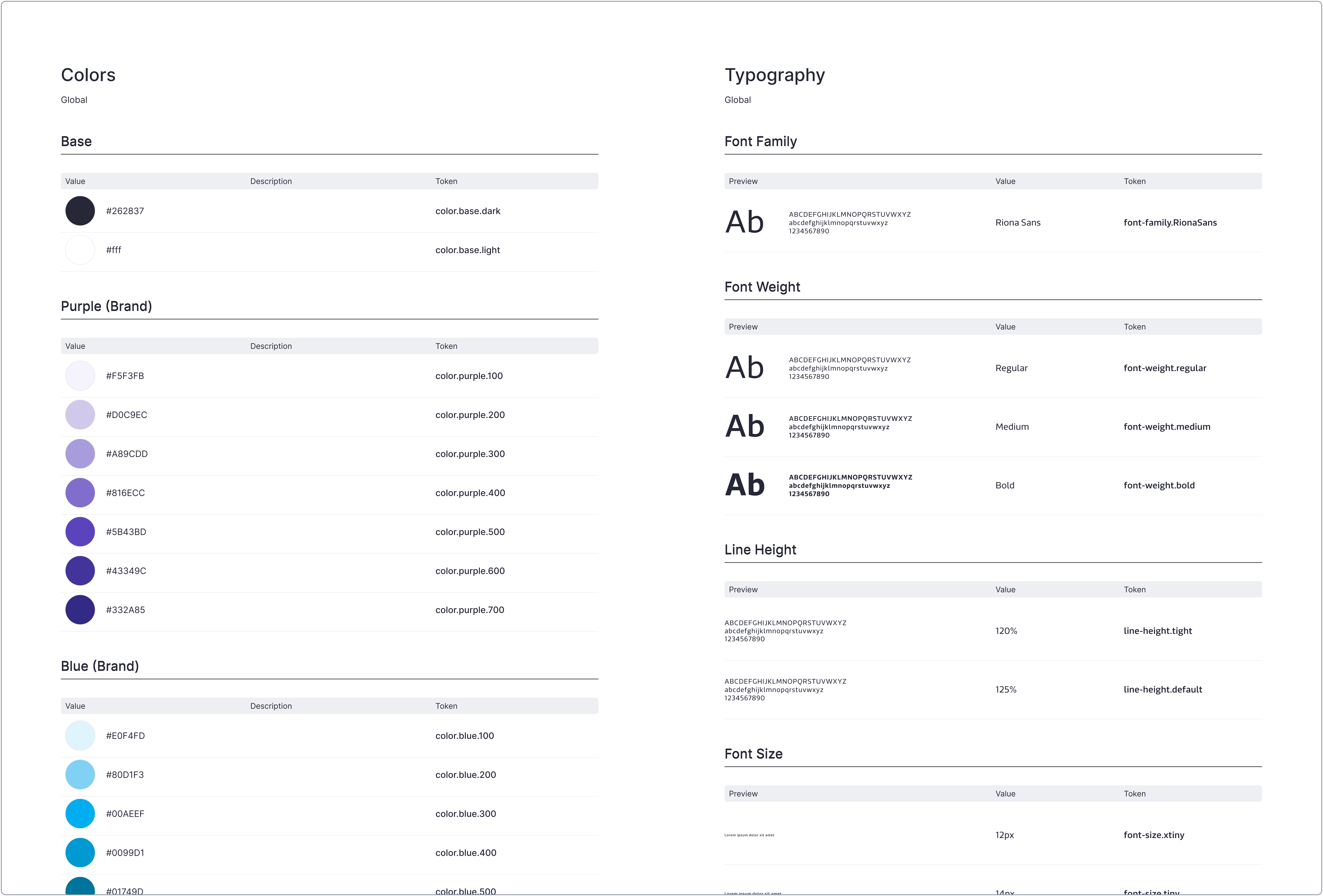
Global Token Documentation — Color & Typography

Form Field Token Documentation
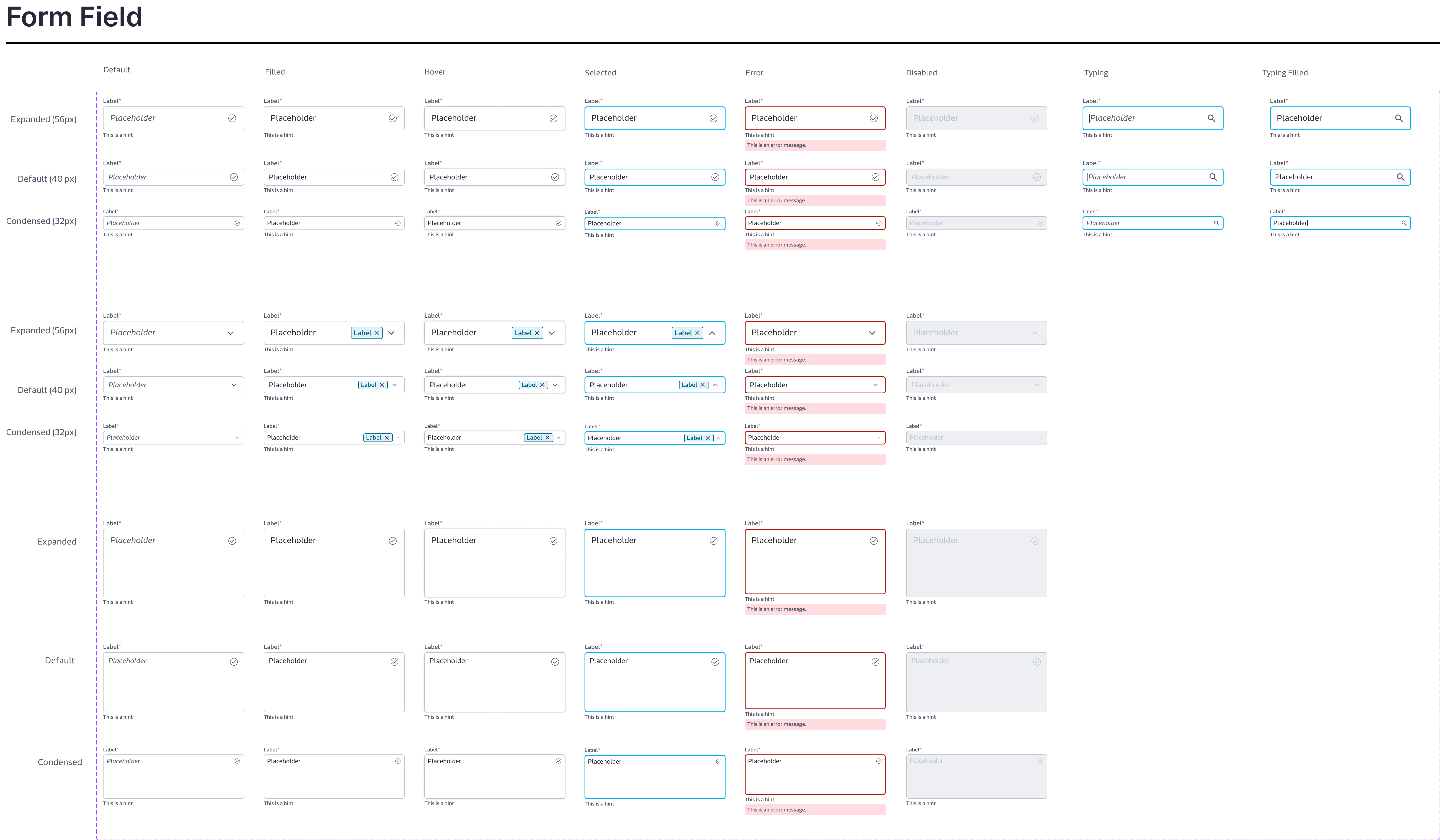
Component Sample — Form Field
Takeaways
- A design system is "the blueprint of a house — it's not just about the individual bricks, but how they fit together to create something greater than the sum of its parts"
- Comprehensive documentation creates a centralized reference resource
- Design systems standardize patterns across navigation, interactions, and color schemes
- Adoption is paramount — higher codebase integration enables easier iteration and unified changes